CSS属性设置
一 字体属性
1、font-weight:文字粗细
| 取值 | 描述 |
|---|---|
| normal | 默认值,标准粗细 |
| bord | 粗体 |
| border | 更粗 |
| lighter | 更细 |
| 100~900 | 设置具体粗细,400等同于normal,而700等同于bold |
| inherit | 继承父元素字体的粗细值 |
2、font-style:文字风格
 normal 正常,默认就是正常的
 italic 倾斜
3、font-size:文字大小
fs:一般是12px或13px或14px

注意:
1、通过font-size设置文字大小一定要带单位,即一定要写px

2、如果设置成inherit表示继承父元素的字体大小值。
4、font-family:文字字体

font-family: "Microsoft Yahei", "微软雅黑", "Arial", sans-serif

常见字体:
serif 衬线字体
sans-serif 非衬线字体
中文:宋体,微软雅黑,黑体

注意:
    1、设置的字体必须是用户电脑里已经安装的字体,浏览器会使用它可识别的第一个值。
    2、如果取值为中文,需要用单或双引号扩起来
5、文字属性简写
/*font-weight: bolder;*/
/*font-style: italic;*/
/*font-size: 50px;*/
/*font-family: 'serif','微软雅黑';*/
简写为
font: bolder italic 50px 'serif','微软雅黑';
6、color:文字颜色
| 取值 | 格式 | 描述 |
|---|---|---|
英文单词 |
color:red; |
大多数颜色都有对应的英文单词描述,但英文单词终究有其局限性:无法表示所有颜色 |
| rgb | color:rgb(255,0,0) |
什么是三原色? 数字的范围0-255,0代表不发光,255代表发光,值越大越亮 红色:rgb(255,0,0) |
| rgba | color:rgba(255,0,0,0.1); |
rgba到css3中才推出,比起rgb多了一个a,a代表透明度 |
| 十六进制 | color: #FF0000; |
#FFEE00 其中FF代表R,EE代表G,00代表B |
二 文本属性
1、text-align:规定元素中的文本的水平对齐方式。
| 值 | 描述 |
|---|---|
| left | 左边对齐 默认值 |
| right | 右对齐 |
| center | 居中对齐 |
2、text-decoration:文本装饰
| 值 | 描述 |
|---|---|
| none | 默认。定义标准的文本。 |
| underline | 定义文本下的一条线。 |
| overline | 定义文本上的一条线。 |
| line-through | 定义穿过文本下的一条线。 |
| inherit | 继承父元素的text-decoration属性的值。 |
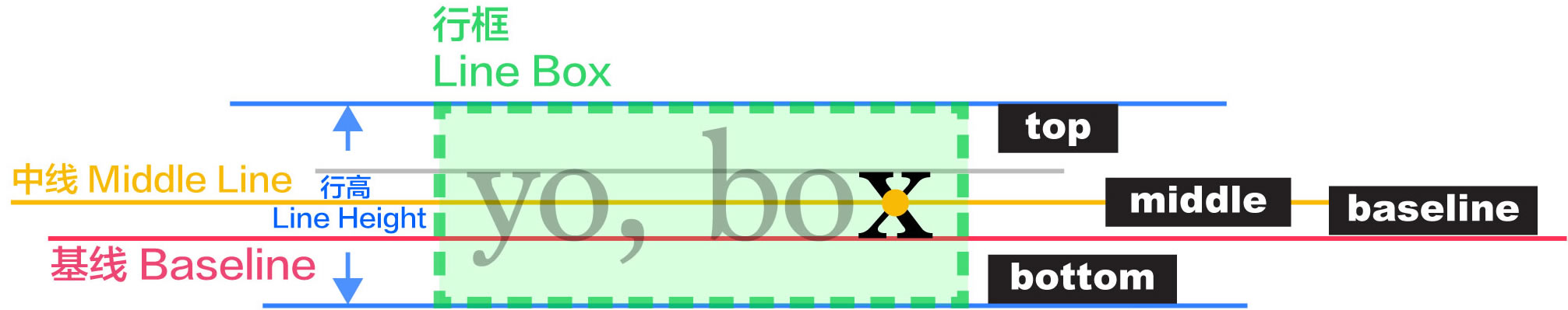
3、line-height:行高


<!DOCTYPE html>
<html lang="en">
<head>
    <meta charset="UTF-8">
    <title>后代选择器</title>

    <style type="text/css">
        p {
             500px;
            height: 200px;
            background-color: yellow;

            text-align: center;

            text-decoration: underline;

            line-height: 200px;
        }
        a {
            text-decoration: none;
        }
    </style>
</head>
<body>

<div>
    <p>hello英雄不问出处,流氓不论岁数</p>
    <a href="#">点我啊</a>
</div>

</body>
</html>
三 背景属性
注意:没有宽高的标签,即便设置背景也无法显示
| 属性 | 描述 | 值 |
|---|---|---|
| background-color |
设置标签的背景颜色的 |
background-color: red; background-color: rgb(0,255,0); background-color: rgba(0,255,0,0.1); background-color: #00ffff; |
| background-image |
设置标签的背景图片 |
background-image: url("images/2.jpg"); background-image: url("图片网址"); 注意:如果图片的大小没有标签的大小大,那么会自动在水平和锤子方向平铺和填充 |
| background-size |
设置标签的背景图片的宽、高 |
background-size: 300px 300px; background-size: 100% 100%; |
| background-repeat |
设置标签的背景图片的平铺方式 |
background-repeat: repeat; #默认值,在垂直和水平方向都重复 |
| background-attachment |
设置标签的背景图片在标签中固定或随着页面滚动而滚动 |
background-attachment: scroll; #默认值,背景图片会随着滚动条的滚动而滚动 |
| background-position |
前端的坐标系": -------------------->x轴 |
background-position:水平方向的值,垂直方向的值 1、具体的方位名词 第一个值是水平位置,第二个值是垂直位置。 3、具体的像素(一定要加px单位) 例如:30px,50px等等 |
| inherit |
设置从父元素继承background属性值 |
以上背景属性的值均可以设置为inherit,代表从父元素继承background属性 |
| 背景缩写 |
|
1、背景属性缩写

<!DOCTYPE html>
<html lang="en">
<head>
    <meta charset="UTF-8">
    <title>后代选择器</title>

    <style type="text/css">
        div {
             500px;
            height: 500px;
            /*background-color: red;*/
            /*background-image: url("https://images2018.cnblogs.com/blog/1036857/201805/1036857-20180510215639652-367382094.jpg");*/
            /*background-repeat: no-repeat;*/
            /*background-position: right bottom;*/
            /*background-size: 100px 100px;*/
            background: red url("https://images2018.cnblogs.com/blog/1036857/201805/1036857-20180510215639652-367382094.jpg") no-repeat right bottom/100px 100px;
        }
    </style>
</head>
<body>

<div></div>

</body>
</html>
2、背景图片和插入图片的区别
#1、
背景图片仅仅只是一个装饰,不会占用位置,
插入图片会占用位置

#2、
背景图片有定位属性,可以很方便地控制图片的位置,
而插入图片则不可以

#3、
插入图片语义比背景图片的语义要强,所以在企业开发中如果你的图片
想被搜索引擎收录,那么推荐使用插入图片
<!DOCTYPE html>
<html lang="en">
<head>
    <meta charset="UTF-8">
    <title>后代选择器</title>

    <style type="text/css">
        .box1 {
             200px;
            height: 200px;
            background-color: red;
            background-image: url("https://images2018.cnblogs.com/blog/1036857/201805/1036857-20180510214613754-737636530.jpg");
            background-repeat: no-repeat;
            background-position: right bottom;
        }
        .box2{
             300px;
            height: 300px;
            background-color: green;
        }

    </style>
</head>
<body>
<div class="box1">
    1111111111111
</div>
<div class="box2">
    22222222222222
    <img src="https://images2018.cnblogs.com/blog/1036857/201805/1036857-20180510214613754-737636530.jpg" alt="">
</div>
</body>
</html>
3、背景图片练习
<!DOCTYPE html>
<html lang="en">
<head>
    <meta charset="UTF-8">
    <title>图片居中显示</title>

    <style type="text/css">
        div {
            height: 500px;
            background-image: url("bg2.jpg");
            background-position: top center;
        }
    </style>
</head>
<body>

<div></div>
</body>
</html>
<!DOCTYPE html>
<html lang="en">
<head>
    <meta charset="UTF-8">
    <title>图片拼接</title>

    <style type="text/css">
        div {
            height: 720px;
            background-image: url("bg1.jpg");

        }
        .box2 {
            background-image: url("ksyx.png");
            background-position: bottom center;
            background-repeat: no-repeat;
        }
    </style>
</head>
<body>

<div class="box1">
    <div class="box2"></div>
</div>
</body>
</html>
<!DOCTYPE html>
<html lang="en">
<head>
    <meta charset="UTF-8">
    <title>导航条</title>

    <style type="text/css">
         .navbar {
             margin: 0 auto;
              920px;
             height: 50px;
             background-image: url("dht.png");
             background-repeat: repeat-x;

        }

    </style>
</head>
<body>

<div class="navbar">
</div>
</body>
</html>
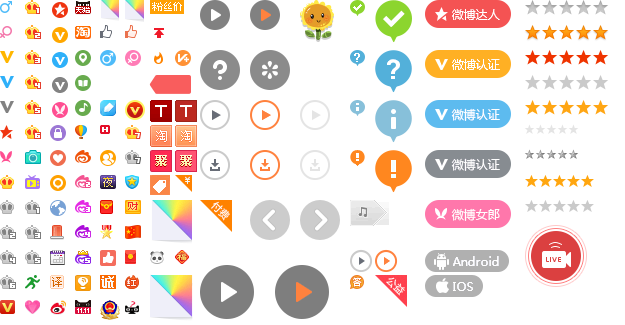
4、精灵图
#1、什么是CSS精灵图(可以通过浏览器抓包分析:微博,京东都有精灵图)
    CSS精灵图是一种图像合成技术

#2、CSS精灵图的作用
    一个电商网站可能有很多图片,比如有10张图片,这就要求客户端发10次请求给服务端
    但其实一次请求的带宽就足够容纳10张图片的大小

    精灵图的作用就是用来较少请求次数,以及降低服务器处理压力


#3、如何使用CSS精灵图
    CSS的精灵图需要配合背景图片和背景定位来使用

#4、强调:切图需要用到frameworks软件,可以知道每个图片具体宽多少个像素高多少个像素,该软件与ps属于一个家族
    在右面,图层-》位图-》出一把锁固定住图片

    然后左侧,有一个切片工具,框住图片
<!DOCTYPE html>
<html lang="en">
<head>
    <meta charset="UTF-8">
    <title>导航条</title>

    <style type="text/css">
         .box1 {
              86px;
             height: 28px;
             background-image: url("https://images2018.cnblogs.com/blog/1036857/201805/1036857-20180510222513182-115432192.png");
             background-repeat: no-repeat;
             background-position: -425px -100px;

        }

    </style>
</head>
<body>

<div class="box1">
</div>
</body>
</html>
四 盒子模型
#什么是CSS盒子模型?
CSS盒子模型仅仅是一个形象的比喻,HTML文档中的每个元素都被描绘成矩形盒子,这些矩形盒子通过一个模型来描述其占用空间,这个模型称为盒子模型。 盒子模型通过四个边界来描述:margin(外边距),border(边框),padding(内填充),content(内容区域),如图所示:
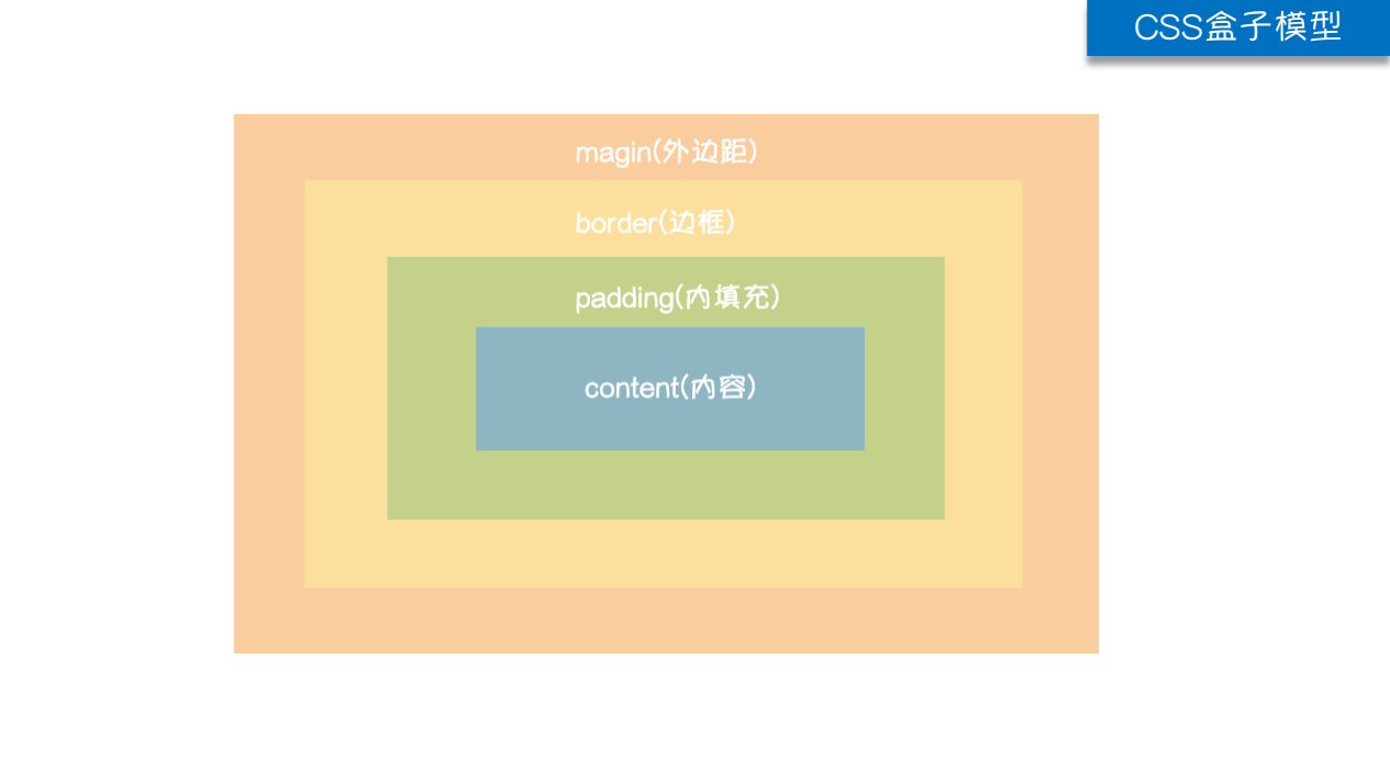
#盒子模型基本概念解析
    如果把一个盒子比喻成一个壁挂相片,
    在HTML中所有的标签都可以设置
        宽度/高度 ===== 指定可以存放内容/相片的区域
        内边距 ===== 内容/相片与边框的距离
        边框 ====== 边框指的就是相框
        外边距 ===== 一个相框与另外一个相框之间的距离

    提示:可以通过谷歌开发者工具查看盒子的各部分属性
1、盒子模型的宽度和高度
#1、内容的宽度和高度
    通过标签的width和height属性设置

#2、元素的宽度和高度
    宽度= 左边框 + 左内边距 + width(内容的宽) + 右内边距 + 右边框高度
    高度= 。。。。

#3、元素空间的宽度和高度
    宽度= 左外边距 + 左边框 + 左内边距 + width(内容的宽) + 右内边距 + 右边框高度 + 右外边距
    高度= 。。。。
<!DOCTYPE html>
<html lang="en">
<head>
    <meta charset="UTF-8">
    <title>盒子模型宽度和高度</title>
    <style>
        span,a,b,strong {
            display: inline-block;
             100px;
            height: 100px;
            border: 6px solid #000;
            padding: 20px;
            margin: 20px;
        }
    </style>
</head>
<body>
<span>我是span</span>
<a href="#"> 我是草链接</a>
<b>我是加粗</b>
<strong>我是强调</strong>

</body>
</html>
如何让 height:100%起作用:你需要给这个元素的所有父元素的高度设定一个有效值。换句话说,你需要这样做:
现在你给div的高度为100%,它有两个父元素<body>和<html>。为了让你的div的百分比高度能起作用,你必须设定<body>和<html>的高度。

<html style="height: 100%;">
  <body style="height: 100%;">
    <div style="height: 100%;">
      <p>
        这样这个div的高度就会100%了
      </p>
    </div>
  </body>
</html>

相似的例子:可以查看qq注册界面https://ssl.zc.qq.com/v3/index-chs.html
2、!!!css显示模式:块级、行内、行内块级
在HTML中HTML将所有标签分为两类,分别是容器级和文本级
在CSS中CSS也将所有标签分为两类,分别是容器级是块级元素和行内元素

#1、HTML中容器级与文本级

    容器级标签:可以嵌套其他的所有标签
    div、h、ul>li、ol>li、dl>dt+dd

    文本级标签:只能嵌套文字、图片、超链接
    span、p、buis、strong、em、ins、del

#2、CSS中块级与行内

    块级:块级元素会独占一行,所有的容器类标签都是块级,文本标签中的p标签也是块级
    div、h、ul、ol、dl、li、dt、dd   还有标签p


    行内:行内元素不会独占一行,所有除了p标签以外的文本标签都是行内
    span、buis、strong、em、ins、del


#3、块级元素与行内元素的区别

    1、块级元素block
        独占一行
        可以设置宽高
            若没有设置宽度,那么默认和父元素一样宽(比如下例中的div的父元素是body,默认div的宽就是body的宽)
            若没有设置宽高,那么就按照设置的来显示

    2、行内元素inline
        不会独占一行
        不可以设置宽高
            盒子宽高默认和内容一样

    3、行内块级元素inline-block
        不会独占一行
        可以设置宽高
<!DOCTYPE html>
<html lang="en">
<head>
    <meta charset="UTF-8">
    <title></title>

    <style>
        /*块级元素*/
        div,p,h1 {
            background-color: red;
             200px;
            height: 100px;
        }

        /*行内元素*/
        span,b,strong {
            background-color: blue;
             200px;
            height: 100px;
        }


        /*行内块级元素*/
        img {
             100px;
            height: 100px;

        }

    </style>
</head>
<body>
<!--块级-->
<div>我是div</div>
<p>我是段落 </p>
<h1>我是标题</h1>
<hr>

<!--行内-->
<span>我是span</span>
<b>我是加粗</b>
<strong>我是强调</strong>
<hr>


<!--行内块级-->
<img src="../imags/1.png" alt="">
<img src="../imags/1.png" alt="">

</body>
</html>
3、!!!CSS显示模式转换
| 属性 | 描述 | 值 |
|---|---|---|
display |
可以通过标签的display属性设置显示模式 |
block 块级 |
4、div与span
布局都是用块级元素,而行内元素是控制内容显示的。
1、div标签
   一般用于配合css完成网页的基本布局

2、span标签
  一般用于配合css修改网页中的一些局部信息,比如一行文字我们只为一部分加颜色<p>我是<span>JetPropellSnake</span></p>

3、div和span有什么区别?
    div一般用于排版,而span一般用于局部文字的样式
    1、站在HTML的角度:div是一个块级元素、独占一行,而span是一个行内元素、不会单独占一行
    2、站在CSS的角度:div是一个容器级标签,而span是一个文本级标签
<!DOCTYPE html>
<html lang="en">
<head>
    <meta charset="UTF-8">
    <title>div与span标签</title>

    <style>
        .header {
            margin: 0 auto;

             980px;
            height: 100px;
            background: pink;

            margin-bottom: 10px;
        }

        .content {
            margin: 0 auto;

             980px;
            height: 500px;
            background: #e9ca37;

            margin-bottom: 10px;

        }

        .footer {
            margin: 0 auto;

             980px;
            height: 100px;
            background: #7e1487;

        }

        .logo {
             200px;
            height: 50px;
            background: #bfccdb;
            float: left;
            margin: 20px;
        }

        .nav {
             600px;
            height: 50px;
            background: palegreen;
            float: right;
            margin: 20px;
        }

        .aside {
             250px;
            height: 460px;
            background: #cccccc;
            float: left;
            margin: 20px;
        }

        .article {
             650px;
            height: 460px;
            background: green;
            float: right;
            margin: 20px;

        }

        span {
            color: red;
        }

    </style>
</head>
<body>

<div class="header">
    <div class="logo"></div>
    <div class="nav"></div>
</div>


<div class="content">
    <div class="aside">
        <p>
            我是<span>JetPropellSnake</span>,一个最接近<span>神的男人</span>
        </p>
    </div>
    <div class="article"></div>
</div>


<div class="footer"></div>


</body>
</html>
五 盒子模型各部分详解
1、border边框
| 同时设置四条边的边框 |
border:边框的宽度 边框的样式 边框的颜色 |
| 分别设置四条边的边框 |
border-left:边框的宽度 边框的样式 边框的颜色 |
| 分别指定宽度、格式、颜色 |
1、连写:(分别设置四条边的边框) |
了解非连写 |
border-left- ; http://www.w3school.com.cn/cssref/pr_border-style.asp |
| 边框的样式 |
none 无边框。 |
| border-radius |
/* 单独设置一个角:数值越大,弧度越大*/ border-top-left-radius: 20px;
|
<!DOCTYPE html>
<html lang="en">
<head>
    <meta charset="UTF-8">
    <title>边框属性</title>
    <style>
        div {
             100px;;
            height: 100px;
        }

        .box1 {
            /*border: 5px solid black;*/

            /*border-left: 5px solid black;*/
            /*border-top: 5px solid black;*/
            /*border-right: 5px solid black;*/
            /*border-bottom: 5px solid black;*/

            border- 5px;
            border-style: solid;
            border-color: black;
        }

        .box2 {
            /*border-left: 5px solid purple;*/
            /*border-top: 5px solid red;*/
            /*border-right: 5px solid green;*/
            /*border-bottom: 5px solid blue;*/

            border- 5px;
            border-style: solid;
            border-color: red green blue purple;

        }

        .box3 {
            /*border: 5px solid red;*/
            /*border-right: 5px dashed red;*/


            border- 5px;
            border-style: solid dashed solid solid;
            border-color: red;
        }

        .box4 {
            border- 5px;
            border-style: solid dashed solid dashed;
            border-color: red;
        }

        .box5 {
            border:5px solid black;
            border-bottom: none;
        }

        /*!!!在企业开发中要尽量降低网页的体积,图片越多,体积肯定越大,访问速度肯定越慢,所以针对简单的图形,可以只用用边框画出来
        使用下面的方法制作就可以
        */
       .box6 {
             0px;
            height: 0px;
            border-25px;
            border-style: solid;
            border-color: black white skyblue white;
            border-bottom: none;
        }


    </style>
</head>
<body>


<div class="box1"></div>
<hr>
<div class="box2"></div>
<hr>
<div class="box3"></div>
<hr>
<div class="box4"></div>
<hr>
<div class="box5"></div>
<hr>
<div class="box6"></div>


</body>
</html>
<!DOCTYPE html>
<html lang="en">
<head>
    <meta charset="UTF-8">
    <title></title>

    <style type="text/css">
        .box1 {
            margin: 0 auto;
            height: 100px;
             920px;
            border-radius: 5px 5px 0px 0px;
            background-color: blue;
        }
    </style>
</head>
<body>
<div class="box1"></div>
</body>
</html>
<!DOCTYPE html>
<html lang="en">
<head>
    <meta charset="UTF-8">
    <title></title>
    <style type="text/css">

        img {
             185px;
            border-radius: 50%;

        }
    </style>
</head>
<body>
    <img src="https://images2018.cnblogs.com/blog/1036857/201805/1036857-20180511163924274-1737036731.png" alt="">
</body>
</html>
2、padding内边距:边框与内容的距离就是内边距
非连写 |
padding-top:20px; |
连写 |
padding:上 右 下 左; |
| 注意 |
1 给标签设置内边距后,标签内容占有的宽度和高度会发生变化,设置padding之后标签内容的宽高是在原宽高的基础上加上padding值。如果不想改变实际大小,那就在用宽高减掉padding对应方向的值 |
<!DOCTYPE html>
<html lang="en">
<head>
    <meta charset="UTF-8">
    <title>内边距属性</title>
    <style>
        div {
             100px;
            height: 110px;
            border: 1px solid red;
        }

        .box1 {
            padding-top: 30px;
        }

        .box2 {
            padding-right: 40px;
        }

        .box3 {
            padding-bottom: 50px;
        }

        .box4 {
            padding-left: 60px;
        }

        .box5 {

            /*只留一个。全都相等*/
            padding: 70px;
            background-color: red;
        }
    </style>
</head>
<body>

<div class="box1">
    我是文字我是文字我是文字我是文字我是文字我是文字我是文字
</div>

<hr>
<div class="box2">
    我是文字我是文字我是文字我是文字我是文字我是文字我是文字
</div>

<hr>
<div class="box3">
    我是文字我是文字我是文字我是文字我是文字我是文字我是文字
</div>

<hr>
<div class="box4">
    我是文字我是文字我是文字我是文字我是文字我是文字我是文字
</div>

<hr>
<div class="box5">
    我是文字我是文字我是文字我是文字我是文字我是文字我是文字
</div>


</body>
</html>
<!DOCTYPE html>
<html lang="en">
<head>
    <meta charset="UTF-8">
    <title></title>
    <style type="text/css">

        .box1 {
            /* 100px;*/
            /*height: 100px;*/
            background-color: red;
            border: 10px solid #000;
            padding: 10px;

             60px;
            height: 60px;
        }
    </style>
</head>
<body>

<div class="box1">我是文字</div>
</body>
</html>
<!DOCTYPE html>
<html lang="en">
<head>
    <meta charset="UTF-8">
    <title></title>
    <style type="text/css">

        .box1 {
             100px;
            height: 100px;
            background-color: red;
            border: 10px solid #000;
            padding: 10px;

            /*本质原理就是做减法*/
            box-sizing: border-box;
        }
    </style>
</head>
<body>

<div class="box1">我是文字</div>
</body>
</html>
3、外边距:标签与标签之间的距离就是外边距
非连写 |
margin-top:20px; |
连写 |
margin:上 右 下 左; |
| 注意 |
1、外边距的那一部分是没有背景颜色的 |
<!DOCTYPE html>
<html lang="en">
<head>
    <meta charset="UTF-8">
    <title>外边距合并现象
    </title>
    <style>
        span {
            display: inline-block;
             100px;
            height: 100px;
            border: 1px solid #000;
        }

        div {
            height: 100px;
            border: 1px solid #000;
        }

        /*水平方向上。外边距会叠加*/
        .hezi1 {
            margin-right: 50px;
        }

        .hezi2 {
            margin-left: 100px;
        }

        /*垂直方向上。外边距不会叠加,会合并成一个,谁比较大就听谁的*/
        .box1 {
            margin-bottom: 50px;
        }

        .box2 {
            margin-top: 100px;
        }
    </style>
</head>
<body>
<!--
快捷创建
span.hezi${我是span}*2
-->

<span class="hezi1">我是span</span><span class="hezi2">我是span</span>

<div class="box1">我是div</div>
<div class="box2">我是div</div>
</body>
</html>
4、内边距vs外边距
#1、在企业开发中,一般情况下如果需要控制嵌套关系盒子之间的距离
       应该首先考虑padding
       其次再考虑margin

       margin本质上是用于控制兄弟直接的关系的,padding本质才是控制父子关系的关系
<!DOCTYPE html>
<html lang="en">
<head>
    <meta charset="UTF-8">
    <title></title>

    <style>

        .JetPropellSnake {
             300px;
            height: 300px;
            background-color: yellow;
            padding: 50px;
            box-sizing: border-box;
        }

        .alex {
             100px;
            height: 100px;
            background-color: green;
        }

        .linhaifeng {
             300px;
            height: 300px;
            background-color: purple;
            padding: 50px;
            box-sizing: border-box;

            margin-top: 100px;
        }

        .liuqingzheng {
             100px;
            height: 100px;
            background-color: blue;
        }


    </style>
</head>
<body>

<div class="JetPropellSnake">
    <div class="alex"></div>
</div>

<div class="linhaifeng">
    <div class="liuqingzheng"></div>
</div>

</body>
</html>
#2、如果两个盒子是嵌套关系,那么设置了里面一个盒子顶部的外边距,那么外面一个盒子也会被顶下来
       如果外面的盒子不想被遗弃顶下来,,那么可以给外面的盒子设置一个边框属性
<!DOCTYPE html>
<html lang="en">
<head>
    <meta charset="UTF-8">
    <title></title>

    <style>

        .JetPropellSnake {
             300px;
            height: 300px;
            background-color: yellow;
            box-sizing: border-box;

            border: 1px solid #000;
        }

        .alex {
             100px;
            height: 100px;
            background-color: green;

            margin-top: 50px;
        }

    </style>
</head>
<body>

<div class="JetPropellSnake">
    <div class="alex"></div>
</div>


</body>
</html>
5、盒子居中与内容居中
内容居中
1、让一行内容在盒子中水平且垂直居中
/*水平居中*/
text-align: center;
/*垂直居中*/
line-height: 500px;

2、让多行内容在盒子中垂直居中(水平居中与单行内容一样)

让行高与盒子高度一样,只能让一行内容垂直居中,如果想让多行内容垂直居中,

比如下面这种,想让div中的多行内容垂直居中,一看div中的文字是两行,每一行
的行高为20,加起来就是40,80-40=40,需要让文字距离顶部pading为20,底部padding为20
*/
height: 80px;
line-height: 20px;

padding-top: 20px;
padding-bottom: 20px;
box-sizing: border-box;
<!DOCTYPE html>
<html lang="en">
<head>
    <meta charset="UTF-8">
    <title>盒子居中和内容居中</title>
    <style>
        div {
             300px;
            height: 300px;
            background-color: red;

            /*多行内容水平居中与单行一样*/
            text-align: center;

            /*多行内容垂直居中*/
            line-height: 30px;
            padding-top: 120px;
            box-sizing: border-box;

        }


    </style>
</head>
<body>

<div>
    我是文字我是文字我是文字我是文字我是文字我是文字我是文字

</div>


</body>
</html>
盒子居中
text-align center;只能让盒子中存储的文字、图片水平居中
如果想让盒子自己相对于父元素水平居中,需要用到
margin: 0 auto;
<!DOCTYPE html>
<html lang="en">
<head>
    <meta charset="UTF-8">
    <title>盒子居中和内容居中</title>
    <style>
         .son {
             300px;
            height: 300px;
            background-color: red;

            /*多行内容水平居中与单行一样*/
            text-align: center;

            /*多行内容垂直居中*/
            line-height: 30px;
            padding-top: 120px;
            box-sizing: border-box;

            /*盒子本身水平居中*/
            margin: 0 auto;

        }

        .father {
             500px;
            height: 500px;
            background-color: yellow;
        }


    </style>
</head>
<body>

<div class="father">
    <div class="son">
    我是文字我是文字我是文字我是文字我是文字我是文字我是文字
    </div>
</div>
</body>
</html>
6、防止文字溢出word-break: break-all;
<!DOCTYPE html>
<html>
<head>
    <meta charset="utf-8">
    <title>欢迎界面</title>
    <style type="text/css">

        div {
             200px;
            height: 200px;

            /*字母、数字溢出,可以用下列属性控制自动换行:允许在单词内换行。
            http://www.w3school.com.cn/cssref/pr_word-break.asp
            */
            word-break: break-all;
        }

        .box1 {
            background-color: red;


        }
        .box2 {
            background-color: green;
        }

        .box3 {
            background-color: blue;
        }
    </style>
</head>
<body>
<div class="box1">
    <p>asdfasdfsadfasdfasdfasdfad sfasdfsadasDSfafsafaasdfasdfasfdqwerqwerwqersdfqerwrsdf你好我的啊啊啊啊啊啊啊啊啊啊啊啊</p>

</div>


<div class="box2">遗憾白鹭上青天两个黄鹂鸣翠柳啊哈哈哈

</div>

<div class="box3">我是12312312312312312312312312312312312312312312312312312312312我
</div>
</body>
</html>
7、清除默认边距
#1、为什么要清空默认边距(外边距和内边距)
浏览器会自动附加边距,在企业开发中为了更好的控制盒子的宽高和计算盒子的宽高等等
编写代码之前的第一件事情就是清空默认的边距

#2、如何清空默认的边距
        * {
            margin: 0px;
            padding: 0px;
        }

#3、注意点:
    通配符选择器会找到(遍历)当前界面中所有的标签,所以性能不好,参考:https://yuilibrary.com/yui/docs/cssreset/

    拷贝代码:
    body,div,dl,dt,dd,ul,ol,li,h1,h2,h3,h4,h5,h6,pre,code,form,fieldset,legend,input,textarea,p,blockquote,th,td{margin:0;padding:0}

    可以查看京东,bat主页也是这么做的,在企业开发中也应该像上面这么写
<!DOCTYPE html>
<html lang="en">
<head>
    <meta charset="UTF-8">
    <title>清除默认边距</title>
    <style>

        /*
        * {
            margin: 0px;
            padding: 0px;
        }
        */


        body,div,dl,dt,dd,ul,ol,li,h1,h2,h3,h4,h5,h6,pre,code,form,fieldset,legend,input,textarea,p,blockquote,th,td{margin:0;padding:0}

        .box1 {
             100px;
            height: 100px;
            background-color: green;
        }
        .box2 {
             100px;
            height: 100px;
            background-color: yellow;
        }
        .box3 {
             100px;
            height: 100px;
            background-color: blue;
        }
    </style>
</head>
<body>

<div class="box1"></div>
<div class="box2"></div>
<div class="box3"></div>

</body>
</html>