元素水平居中的第一种方式 子元素不需要宽度也可以
<div class="box">
    <div class="son"> 我是内容 </div>
</div>

.box {
     500px;
    height: 300px;
    background: pink;
}
.son {
     300px;
    margin: auto;
    text-align: center;
    background: red;
}

使用的是margin:auto
这样在水平方向上就可以居中了

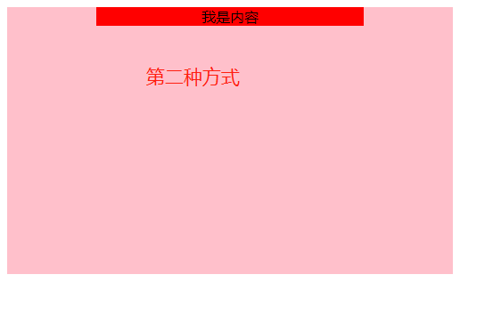
margin: 100px auto 注意点:
有的小伙伴说:想要上下有一点的间距
可以使用 margin: 100px auto;
但是使用之后,我们发现了一些小的问题。
从上面效果图可以发现:两个盒子同时向下移动。
这种情况并不是我们想要的。
出现是由 margin塌陷导致的

如何解决这种问题呢?
可以将父元素box变为BFC:overflow: hidden; [ 注意不是超出隐藏的作用 ]

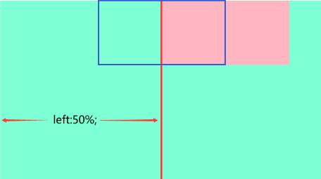
position + left:50% + margin-left:-px 第二种 子元素需要宽度
<div class="box">
    <div class="son"> 我是内容 </div>
</div>

.box {
     500px;
    height: 300px;
    background: pink;
    position: relative;
}

.son {
     300px;
    background: red;
    position: absolute;
    text-align: center;
    left: 50%;
    /* 当前盒子的一半 */
    margin-left: -150px;
}
注意点 left: 50%和 margin-left的区别
扩展点设置left: 50%;并不能实现水平居中的效果:
它是相对父级元素。【相对于父元素box的宽度】
margin-left它是相对自己的宽度。【相对于自己son的宽度】
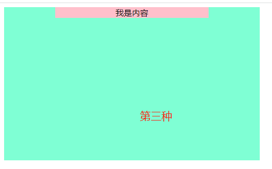
定位 position + left+ translateX(-50%) 推荐 子元素不要宽度也可以
<div class="box">
    <div class="son"> 我是内容 </div>
</div>

.box {
     500px;
    height: 300px;
    background: aquamarine;
    position: relative;
}

.son {
     300px;
    text-align: center;
    background: pink;
    position: absolute;
    left: 50%;
    transform: translateX(-50%);
}
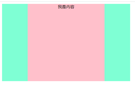
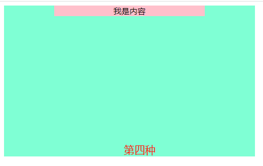
父text-align:center + 子display:inline-block 子元素不要宽度也可以
 <div class="box">
    <div class="son"> 我是内容 </div>
</div>

.box {
     500px;
    height: 300px;
    background: aquamarine;
    text-align: center;
}

.son {
     300px;
    text-align: center;
    background: pink;
    display: inline-block;
}

注意点:
如果仅使用 text-align:center; 是无法达到水平居中的效果的,为什么?
text-align:center; 需要在行内块元素上使用的,
而盒子是块级元素,所以。
需要将盒子转换为行内块元素 text-align:center; 才能生效。
弹性布局:display:flex; [推荐] 子元素不要宽度也可以
<div class="box">
    <div class="son"> 我是内容 </div>
</div>

.box {
     500px;
    height: 300px;
    background: aquamarine;
    display: flex;
    justify-content: center;
}

.son {
     300px;
    text-align: center;
    background: pink;
}