目录:
1. 介绍
XPopup是一个弹窗库,可能是Harmony平台最好的弹窗库。它从设计的时候就本着实用的原则,兼顾了美观和优雅的交互。用户都喜欢自然舒适的UI和交互,希望XPopup能带给你一些帮助或者惊喜!
2. 效果一览
| 内置弹窗(支持复用已有布局) | 列表Center弹窗 |
|---|---|
 |
 |
| Bottom列表弹窗 | 自定义Bottom弹窗 |
|---|---|
 |
 |
| Attach弹窗(动画优雅,智能定位,长按支持) | 自定义Attach弹窗(任意方向支持,灵活易用) |
|---|---|
 |
 |
| Drawer弹窗 | 全屏弹窗(可作为Ability替代品,搭配十几个动画使用更佳) |
|---|---|
 |
 |
| Position自由定位弹窗(放在屏幕任意地方) | 自定义底部弹窗 |
|---|---|
 |
 |
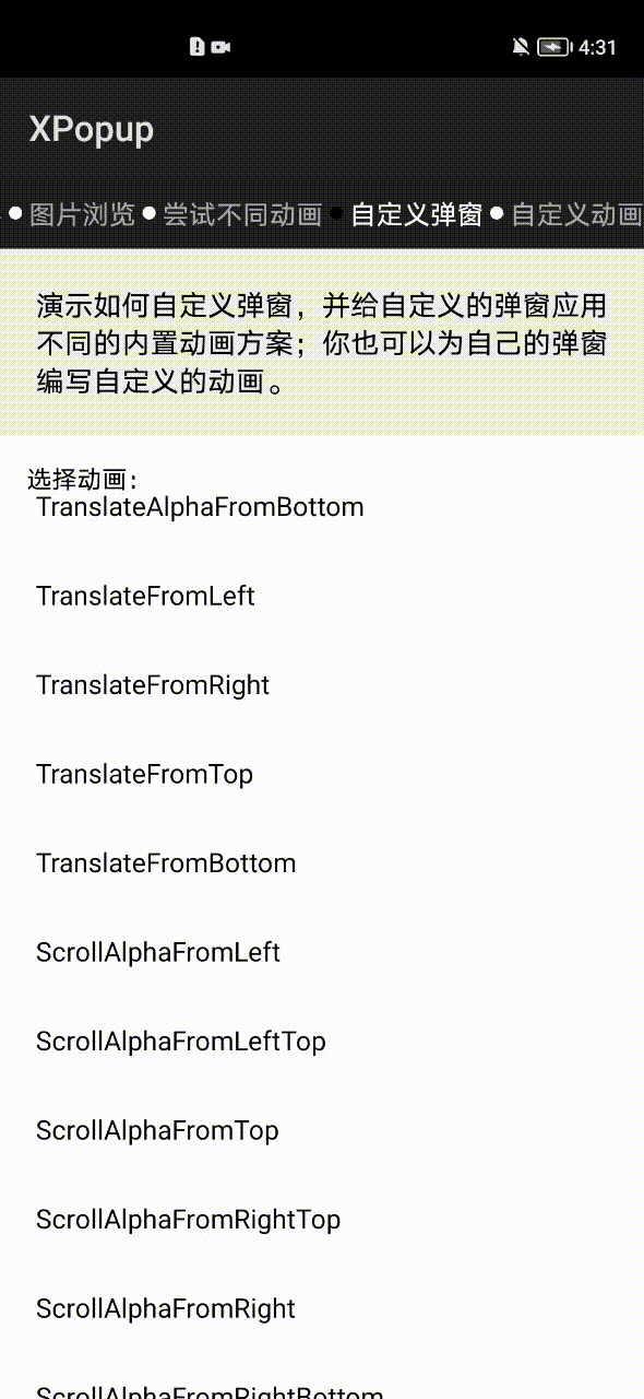
| 自定义弹窗和自定义动画 | 内置优雅美观的动画器,可搭配弹窗结合使用 |
|---|---|
 |
 |
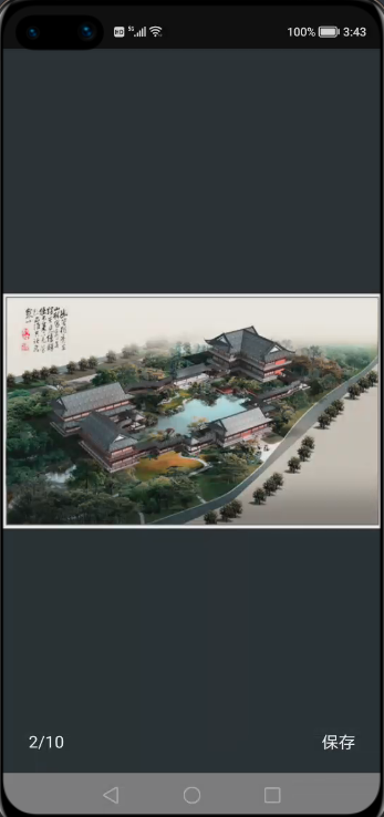
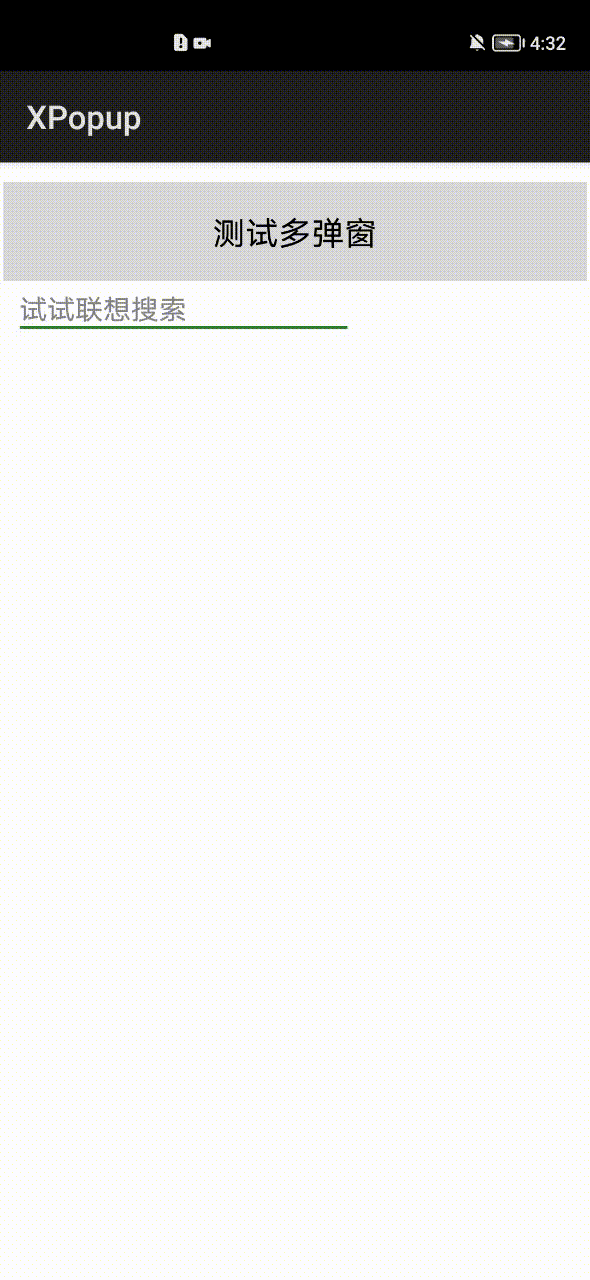
| ImageViewer大图浏览弹窗 | 联想搜索实现,轻而易举 |
|---|---|
 |
 |
3. 依赖
4. 如何使用
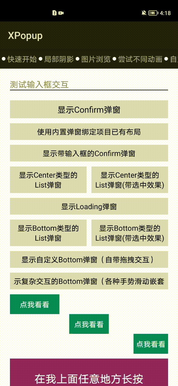
4.1 内置弹窗的使用
4.1.1 显示确认和取消对话框
4.1.2 显示待输入框的确认和取消对话框
4.1.3 显示中间弹出的列表弹窗
4.1.4 显示中间弹出的加载框
4.1.5 显示从底部弹出的列表弹窗
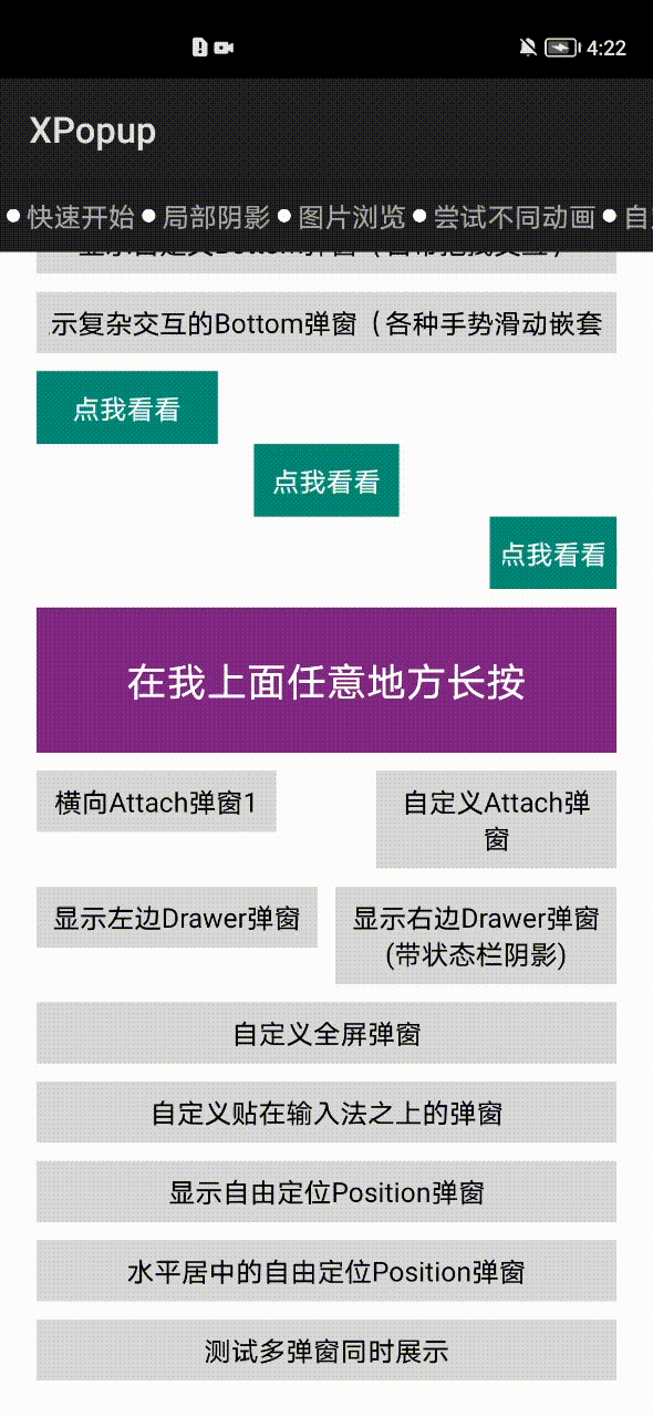
4.1.6 显示依附于某个Component或者某个点的弹窗
如果是想依附于某个Component的触摸点,则需要先watch该Component,然后当单击或长按触发的时候去显示:
asAttachList方法内部是对AttachPopupView的封装,如果你的布局不是列表,可以继承AttachPopupView实现自己想要的布局。AttachPopupView会出现在目标的上方或者下方,如果你想要出现在目标的左边或者右边(像微信朋友圈那样点赞的弹窗),可以继承HorizontalAttachPopupView,然后编写你的布局即可。
最简单的示例如下:
4.1.7 显示大图浏览弹窗
如果你用的不是Glide,请参考去实现即可。
4.1.8 关闭弹窗
先拿到弹窗对象,以Loading弹窗为例,其他也是一样:
执行消失:
我们在项目中经常会点击某个按钮然后关闭弹窗,接着去做一些事。比如:点击一个按钮,关闭弹窗,然后开启一个界面,要知道弹窗的关闭是有一个动画过程的,上面的写法会出现弹窗还没有完全关闭,就立即跳页面,界面有一种顿挫感;而且在设备资源不足的时候,还可能造成丢帧。所以很多时候不推荐直接使用dismiss()方法,除非你关闭完弹窗后面没有任何逻辑执行。
为了得到最佳体验,您可以等dismiss动画完全结束去执行一些东西,而不是立即就执行。可以这样做:
每个弹窗本身也有onShow()和onDismiss()的生命周期回调,可以根据需要使用。
还有这样一种场景:弹窗show()完之后,你的逻辑执行完毕,然后调用dismiss()。但是你的逻辑执行过快,可能导致弹窗的show动画还没有执行完就直接dismiss了,界面上的感觉并不好。这个时候推荐使用smartDismiss()方法,这个方法能保证弹窗的show动画执行完再关闭弹窗。
4.1.9 复用项目已有布局
如果你项目中已经有写好的弹窗布局,而想用XPopup提供的动画和交互能力,也是完全没有问题的。目前支持设置自定义布局的弹窗有:
- Confirm弹窗,就是确认和取消弹窗
- 带输入框的Confirm弹窗
- Loading弹窗
- 带列表的Attach弹窗,Center弹窗和Bottom弹窗
假设,你想使用XPopup的Confirm弹窗,但布局想用自己的,只需要这样设置一下,其他不用动即可:
这样布局就是您自己的了,动画和交互XPopup会帮你完成。但是需要注意的是,你自己提供的布局必须包含一些id,否则XPopup无法找到控件;id必须有,控件你可以随意组合与摆放。具体如下:
- Confirm弹窗必须包含的Text以及id有:tv_title,tv_content,tv_cancel,tv_confirm
- 带输入框的Confirm弹窗在Confirm弹窗基础上需要增加一个id为et_input的TextField
- Loading弹窗,如果你想显示一个Loading文字说明,则必须有一个id为tv_title的Text;如果不需要文字说明,则没要求
- 带列表的弹窗会多一个bindItemLayout()方法用来绑定item布局
- 其他不在多说,看bindLayout方法说明,会说明要求哪些id
每种内置弹窗的bindLayout和bindItemLayout的要求都在方法说明上,无需记忆,用的时候查看下方法的说明即可。
4.2 自定义弹窗
当你自定义弹窗的时候,需要根据需求选择继承CenterPopupView,BottomPopupView,AttachPopupView/HorizontalAttachPopupView,DrawerPopupView,PartShadowPopupView,FullScreenPopupView,PositionPopupView其中之一。
每种弹窗的功能和使用场景如下:
- CenterPopupView:中间弹窗的弹窗,比如:确认取消对话框,Loading弹窗等,如果不满意默认的动画效果,可以设置不同的动画器
- BottomPopupView:从底部弹出的弹窗,比如:从底部弹出的分享弹窗,知乎的从底部弹出的评论弹窗,抖音从底部弹出的评论弹窗。这种弹窗带有智能的嵌套滚动和手势拖动
- AttachPopupView/HorizontalAttachPopupView:Attach弹窗是需要依附于某个点或者某个Component来显示的弹窗;其中AttachPopupView会出现在目标的上方或者下方。如果希望想要微信朋友圈点赞弹窗那样的效果,出现在目标的左边或者右边,则需要继承 HorizontalAttachPopupView来做
- DrawerPopupView:从界面的左边或者右边弹出的像DrawerLayout那样的弹窗,Drawer弹窗本身是横向滑动的,但对PageSlider和ScrollView等横向滑动控件做了兼容,在弹窗内部可以放心使用它们
- FullScreenPopupView:全屏弹窗,看起来和Ability 一样。该弹窗其实是继承Center弹窗进行的一种实现,可以设置任意的动画器
- ImageViewerPopupView:大图浏览弹窗
- PositionPopupView:自由定位弹窗,如果你想让弹窗显示在左上角,或者右上角,或者任意位置,并且不需要依附任何Component,此时你需要它
自定义弹窗只有2个步骤:
一:根据自己的需求编写一个类继承对应的弹窗
二:重写getImplLayoutId()返回弹窗的布局,在onCreate中像Ability那样编写你的逻辑即可
注意:自定义弹窗本质是一个自定义控件,但是只需重写一个参数的构造,其他的不要重写,所有的自定义弹窗都是这样。
4.2.1 自定义Center弹窗
注意:Center弹窗的最大宽度默认是屏幕宽度的0.8,如果你自定义布局的宽度是写死的,有可能超出屏幕宽度的0.8,如果你不想被最大宽度限制,只需要重写方法:
使用自定义弹窗:
4.2.2 自定义Attach弹窗
4.2.3 自定义DrawerLayout类型弹窗
使用自定义的DrawerLayout弹窗:
4.2.4 自定义Bottom类型的弹窗
自定义Bottom类型的弹窗会比较常见,默认Bottom弹窗带有手势交互和嵌套滚动;如果您不想要手势交互可以调用enableDrag(false)方法关闭。
请注意:弹窗的宽高是自适应的,大部分情况下都应该将弹窗布局的高设置为match_content;除非你希望得到一个高度撑满的弹窗。
Demo中有一个模仿知乎评论的实现,代码如下:
4.2.5 自定义全屏弹窗
4.2.6 自定义ImageViewer弹窗
目前大图浏览弹窗支持在上面添加任意自定义布局和背景颜色,做法是写一个类继承ImageViewerPopupView弹窗,然后重写布局即可。
代码如下:
由于是自定义的大图浏览弹窗,就要用自定义弹窗的方式来开启了:
4.2.7 自定义Position弹窗
自由定位弹窗,默认是显示在屏幕的左上角,你可以通过offsetX()和offsetY()来控制显示位置,如果你希望水平居中,可以用isCenterHorizontal(true)选项来做到。
4.3 自定义动画
自定义动画已经被设计得非常简单,动画和弹窗是无关的;这意味着你可以将动画设置给内置弹窗或者自定义弹窗。继承PopupAnimator,实现3个方法:
-
如何初始化动画
-
动画如何开始
-
动画如何结束
比如:自定义一个旋转的动画:
使用自定义动画:
不想要动画:
4.4 常用设置
4.4.1 全局设置
-
设置主色调 默认情况下,XPopup的主色为灰色,主色作用于Button文字,TextField边框和光标,Check文字的颜色上。 主色调只需要设置一次即可,可以放在启动页中。
4.4.2 常用设置
所有的设置如下,根据需要使用:
5. 下载链接
5.1 IDE下载链接
https://developer.harmonyos.com/cn/develop/deveco-studio#download
5.2 源码链接
https://gitee.com/openharmony-tpc/XPopup
设置全局的动画时长 默认情况下,弹窗的动画时长为360毫秒。你可以通过下面的方法进行修改: