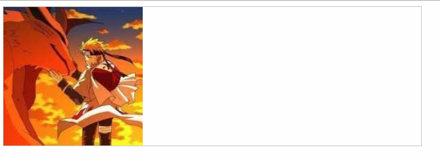
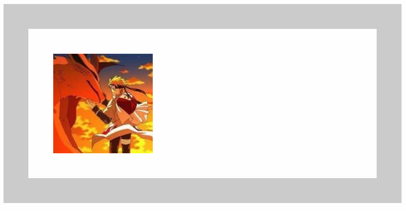
一、多重背景图片
①CSS3允许我们在一个元素上添加多个图片
②多重背景可以把多个图片资源添加到background属性上,用逗号隔开,然后用background-position把他们定位到你想要的位置
<div class="box"></div>
  .box{
  width: 600px;
  height: 200px;
  border: 1px solid #000;
  background: url('1.jpg') no-repeat,url('2.jpg') no-repeat 200px 0,url(‘3.jpg’) no-repeat 400px 0;
}
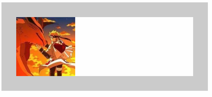
二、图片起始位置background-origin
①background-origin允许我们定义图片从哪儿开始定位,可选的属性值padding-box(默认)、border-box、content-box
②padding-box默认图片从内边距开始
<div class="box"></div>
        .box{
            width: 600px;
            height: 200px;
            border: 50px solid #ccc;
            background: url('1.jpg') no-repeat;
            background-origin: padding-box;
        }
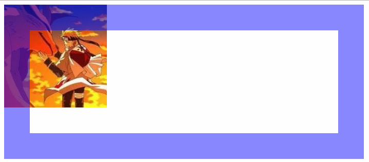
③border-box定义图片从边框开始
<div class="box"></div>
        .box{
            width: 600px;
            height: 200px;
            border: 50px solid rgba(0, 0, 255, 0.5);
            background: url('1.jpg') no-repeat;
            background-origin: border-box;
        }
④content-box定义从元素的内容部分为起始位置
<div class="box"></div>
        .box{
            width: 600px;
            height: 200px;
            border: 50px solid #ccc;
            background: url('1.jpg') no-repeat;
            background-origin: content-box;
            padding: 50px;
        }
三、图片裁剪background-clip
①即使背景图的起始位置设置为内容区 ,但这不代表图片就被限制在内容区 ,在整个元素边框及边框以内都是可以绘制的 (去掉了no-repeat)
<div class="box"></div>
        .box{
            width: 600px;
            height: 200px;
            border: 50px solid rgba(0, 0, 255, 0.6);
            background: url('1.jpg');
            background-origin: content-box;
            padding: 50px;
        }
②使用background-clip属性 ,可以裁剪图片,设置图片显示范围,与content-origin的属性值类似 ,有padding-box(默认)、border-box、content-box
<div class="box"></div>
        .box{
            width: 600px;
            height: 200px;
            border: 50px solid rgba(0, 0, 255, 0.6);
            background: url('1.jpg');
            background-origin: content-box;
            padding: 50px;
            background-clip: content-box;
        }
四、图片尺寸background-size
①两个像素值控制宽高
        .box{
            width: 600px;
            height: 200px;
            border: 1px solid #ccc;
            background: url('1.jpg') no-repeat;
            background-size: 100px 300px
        }
②写一个像素值就代表宽和高像素相同
        .box{
            width: 600px;
            height: 200px;
            border: 1px solid #ccc;
            background: url('1.jpg') no-repeat;
            background-size: 100px
        }
③cover是覆盖整个区域,在这个例子中宽度会占满
        .box{
            width: 600px;
            height: 200px;
            border: 1px solid #ccc;
            background: url('1.jpg') no-repeat;
            background-size: cover;
        }

④contain是保证图片在区域内最大显示,在这个例子中高度会占满
        .box{
            width: 600px;
            height: 200px;
            border: 1px solid #ccc;
            background: url('1.jpg') no-repeat;
            background-size: contain;
        }