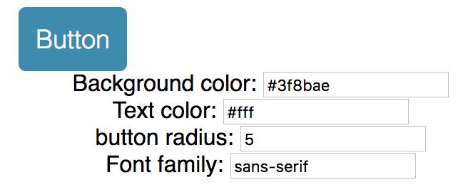
SASS Bootstrap allows us to configure theme or branding variables that affect all components (e.g. Primary Color or Link Color). When we isolate our styles inside React components we lose the ability to theme them. To get round this we can put our theme variables on the context of our app and then read them from individual components in order to make styling decisions. Recompose allows us to create the helper functions we need to do this yielding concise, functional declarative UI components. These components will respond in real time to changes in the theme.
We have a default theme file:
export default {
    color: {
        keyColor: '#3f8bae',
        textLight: '#fff',
    },
    number: {
        buttonRadius: 5
    },
    string: {
        mainFontFamily: 'sans-serif'
    }
}
We want Component get defualt theme according to the file.
We will build an interface to update theme according to user input.

We can import theme file into the App.js compoent and pass down to the custom component. The problem is that, if we have hunders components, it is not ideal to passdown the props hundres times.
That's why we need context.
We can use 'recompose' to do that:
import React, { Component } from 'react';
import {compose, withState} from 'recompose';

import myDefaultTheme from './themes/default';
import Button from './components/Button';

class App extends Component {
    static childContextTypes = {
        theme: React.PropTypes.object
    };

    getChildContext() {
        return {theme: this.props.theme}
    }

    render() {
        const {theme, updateTheme} = this.props;
        return (
            <div className="App">
                <main className="container">
                    ...
                </main>
            </div>
        );
    }
}

const enhance = compose(
    withState('theme', 'updateTheme', myDefaultTheme)
);
export default enhance(App);
So for this part of code:
const enhance = compose(
    withState('theme', 'updateTheme', myDefaultTheme)
);
export default enhance(App);
We wrap our App component with 'enhance' to update component props.
widthState function: Passes two additional props to the base component: a state value, and a function to update that state value. so 'updateTheme' will take nextProps to udpate current props.
    static childContextTypes = {
        theme: React.PropTypes.object
    };

    getChildContext() {
        return {theme: this.props.theme}
    }
Those code helps us to pass 'theme' down to children components.
Also need to create a file called "hocs.js" which means high order component. This file contains reusable methods to update the custom component.
To get context from 'App.js', we need 'getContext' method form 'recompose':
export const getTheme = getContext({
                                       theme: PropTypes.shape({
                                                                  color: PropTypes.object,
                                                                  number: PropTypes.object,
                                                                  string: PropTypes.object
                                                              })
                                   });
We also need a 'themeStyle' method to update style:
export const themeStyle = mapThemeToStyle => mapProps(
    props => {
        const { theme, style } = props;

        return {
            ...props,
            style: [
                mapThemeToStyle(theme, props),
                style
            ]
        };
    }
);
It takes a updater function called 'mapThemeToStyle' which can map theme to style according to different components needs.
Now in the custom component, let compose those:
import React from 'react';
import {
    mapProps,
    compose,
    defaultProps,
    setDisplayName,
    componentFromProp
} from 'recompose';
import Radium from 'radium';

import {
    getTheme,
    themeStyle,
    addStyle
} from './hocs';

const mapThemeToStyle = ({
                            color,
                            number,
                            string
                         }) => {
    return {
        ...(color.keyColor &&
            {backgroundColor: color.keyColor} || {}
        ),
        color: color.textLight,
        borderRadius: number.buttonRadius,
        fontFamily: string.mainFontFamily
    };
};

const style = {
    backgroundColor: 'red',
    borderWidth: 0,
    borderStyle: 'solid',
    boxSizing: 'border-box',
    fontFamily: 'sans-serif',
    fontSize: 18,
    borderRadius: 3,
    fontWeight: 100,
    padding: 12,
    verticalAlign: 'middle',
    whiteSpace: 'nowrap',
    color: 'white',
    alignItems: 'center',
    justifyContent: 'center',
    textDecoration: 'none',
    display: 'flex',
    flex: 1,
    cursor: 'pointer',
    ':hover': {
        backgroundColor: 'purple'
    }
};

const enhance = compose(
    getTheme, // using the container's defined theme
    themeStyle(mapThemeToStyle), // apply the default theme to the component
    addStyle(style),
    setDisplayName('Button'),
    defaultProps({
        element: 'button'
                 }),
    Radium
);
export default enhance(componentFromProp('element'));