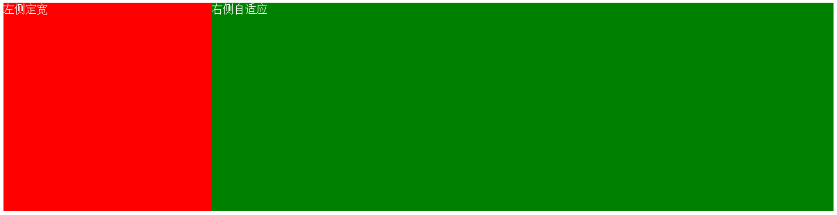
一、左侧定宽,右侧自适应
1. 使用float和margin实现
html
<div class="left">左侧定宽</div>
<div class="right">右侧自适应</div>
css
  .left{
    background-color: red;
    float: left;
    width: 300px;
    height:300px;
  }
  .right{
    background-color: green;
    margin-left: 300px;
    height:300px;
  }
效果图
2. 使用float+margin(fix)实现
html
<div class="left">左侧定宽</div>
<div class="right-parent">
  <div class="right">
    利用float+margin(fix)实现
  </div>
</div>
css
  .left{
    background-color: red;
    float: left;
    width: 100px;
    height:300px;
  }
  .right-parent{
    float: right;
    margin-left: -100px;
    width: 100%;
  }
  .right{
    background-color: green;
    margin-left:100px;
    height:300px;
  }
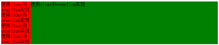
3. 使用float+overflow实现
html
<div class="parent">
  <div class="div1">使用float和overflow实现</div>
</div>
css
.parent{
  overflow: hidden;
  background-color: red;
  height:300px;
}
.div1{
  float: left;
  width: 100px;
  background-color: green;
  height:300px;
}
效果图

如何实现两侧等高?
html
<div class="parent">
  <div class="left">
  使用float和overflow实现使用float和overflow实现使用float和overflow实现使用float和overflow实现
  </div>
  <div class="right">使用float和overflow实现</div>
</div>
css
.left{
  width:100px;
  float:left;
  background-color: red;
}
.right{
  overflow:hidden;
  background-color: green;
}
.parent{
  overflow:hidden;
}
.left,.right{
  padding-bottom:9999px;
  margin-bottom:-9999px;
}
效果图
parent设置overflow:hidden的作用:触发BFC,同时根据BFC布局规则“计算BFC高度时,浮动元素参与计算”,因此,parent的高度由left和right中内容较高者决定。而left和right的外边距-9999px刚好抵消内边距9999px,造成一种两边一样高的“假象”。
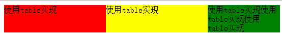
4. 使用table实现
html
<div class="parent">
  <div class="left">使用table实现使用table实现使用table实现</div>
  <div class="right">使用table实现使用table实现</div>
</div>
css
.left{
  width:100px;
  background-color: red;
}
.right{
  background-color: green;
}
.parent{
  display: table;
  table-layout: fixed;
  width: 100%;
}
.left,.right{
  display: table-cell;
}
效果图

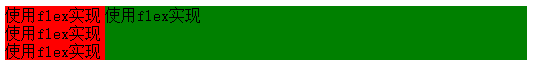
5. 使用flex实现
html
<div class="parent">
  <div class="left">使用table实现使用table实现使用table实现</div>
  <div class="right">使用table实现</div>
</div>
css
.left{
  width: 100px;
  background-color: red;
}
.right{
  flex: 1;
  background-color: green;
}
.parent{
  display: flex;
}
效果图
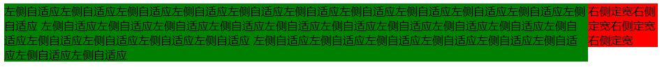
二、右列定宽,左侧自适应
1. 使用float+margin实现(第一种)
html
<div class="right">右侧定宽右侧定宽右侧定宽右侧定宽</div>
<div class="left">左侧自适应</div>
css
.left{
  background-color: green;
  margin-right: 100px;
}
.right{
  background-color: red;
  width: 100px;
  float: right;
}
效果图
注意:在这种方法中,html中的right一定要写在left后面才能达到上面的效果。这是因为right通过设置float脱离文档流了,所以left等其他元素在定位的时候就当没有看见他
2. 使用float+margin实现(第二种)
html
<div class="parent">
    <div class="left">左侧自适应左侧自适应左侧自适应左侧自适应左侧自适应左侧自适应左侧自适应左侧自适应左侧自适应左侧自适应左侧自适应
            左侧自适应左侧自适应左侧自适应左侧自适应左侧自适应左侧自适应左侧自适应左侧自适应左侧自适应左侧自适应左侧自适应左侧自适应左侧自适应左侧自适应
            左侧自适应左侧自适应左侧自适应左侧自适应左侧自适应左侧自适应左侧自适应左侧自适应
    </div>
</div>
<div class="right">右侧定宽右侧定宽右侧定宽右侧定宽</div>
css
.parent{
  margin-right: -100px;
  float: left;
  width: 100%;
}
.left{
  background-color: green;
  margin-right: 100px;
}
.right{
  background-color: red;
  width: 100px;
  float: right;
}
效果图
3. 使用table实现
html
<div class="left">左侧自适应</div>
<div class="right">右侧定宽右侧定宽右侧定宽右侧定宽</div>
css
.parent{
  display: table;
  table-layout: fixed;
  width: 100%;
}
.left{
  background-color: green;
  display: table-cell;
}
.right{
  background-color: red;
  display: table-cell;
  width: 100px;
}
效果图

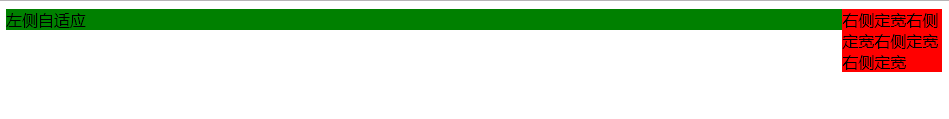
4. 使用flex实现
html
<div class="parent">
    <div class="left">左侧自适应</div>
    <div class="right">右侧定宽右侧定宽右侧定宽右侧定宽</div>
</div>
css
.parent{
  display: flex;
}
.left{
  background-color: green;
  flex: 1;
}
.right{
  background-color: red;
  width: 100px;
}
效果图

三、两列定宽,一列自适应
1. 使用float+margin实现
html
<div class="left">使用float+margin实现</div>
<div class="center">使用float+margin实现</div>
<div class="right">用float+margin实现使用float+margin实现</div>
css
.left,.center{
  width:100px;
  float: left;
}
.left{
  background-color: red;
}
.center{
  background-color: yellow;
}
.right{
  margin-left: 200px;
  background-color: green;
}
效果图
2. 使用float+overflow实现
html
<div class="left">使用float+overflow实现</div>
<div class="center">使用float+overflow实现</div>
<div class="right">使用float+overflow实现使用float+overflow实现使用float+overflow实现</div>
css
.left,.center{
  width:200px;
  float: left;
}
.left{
  background-color: red;
}
.center{
  background-color: yellow;
}
.right{
  overflow: hidden;
  background-color: green;
}
效果图

3. 使用table实现
html
<div class="parent">
  <div class="left">使用table实现</div>
  <div class="center">使用table实现</div>
  <div class="right">使用table实现使用table实现使用table实现</div>
</div>
css
.parent{
  display: table;
  table-layout: fixed;
  width:100%;
}
.left,.center,.right{
  display: table-cell;
}
.left,.center{
  width: 200px;
}
.left{
  background-color: red;
}
.center{
  background-color: yellow;
}
.right{
  background-color: green;
}
效果图
4. 使用flex实现
html
<div class="parent">
  <div class="left">使用flex实现</div>
  <div class="center">使用flex实现</div>
  <div class="right">使用flex实现使用flex实现使用flex实现</div>
</div>
css
.parent{
  display: flex;
  table-layout: fixed;
  width:100%;
}
.left,.center{
  width: 200px;
}
.left{
  background-color: red;
}
.center{
  background-color: yellow;
}
.right{
  flex: 1;
  background-color: green;
}
效果图

四、双飞翼布局
1. 使用float+margin实现
html
<div class="left">left</div>
<div class="parent">
  <div class="center">center</div>
</div>
<div class="right">right</div>
css
.left,.right,.parent{
  float: left;
}
.left,.right{
  width: 200px;
}
.left{
  background-color: green;
}
.right{
  background-color: yellow;
}
.parent{
  margin-right: -200px;
  margin-left: -200px;
  width: 100%;
}
.center{
  background-color: red;
  margin-right: 200px;
  margin-left: 200px;
}
效果图

2.
未完待续。。。。。