解决移动端1px边框问题的几种方法
本文介绍了解决移动端1px边框问题的5种方法。当然了,在这之前先整理了与这些方法相关的知识:物理像素、设备独立像素、设备像素比和viewport。
物理像素、设备独立像素和设备像素比
在CSS中我们一般使用px作为单位,需要注意的是,CSS样式里面的px和物理像素并不是相等的。CSS中的像素只是一个抽象的单位,在不同的设备或不同的环境中,CSS中的1px所代表的物理像素是不同的。在PC端,CSS的1px一般对应着电脑屏幕的1个物理像素,但在移动端,CSS的1px等于几个物理像素。
物理像素(physical pixel)
物理像素又被称为设备像素、设备物理像素,它是显示器(电脑、手机屏幕)最小的物理显示单位,每个物理像素由颜色值和亮度值组成。所谓的一倍屏、二倍屏(Retina)、三倍屏,指的是设备以多少物理像素来显示一个CSS像素,也就是说,多倍屏以更多更精细的物理像素点来显示一个CSS像素点,在普通屏幕下1个CSS像素对应1个物理像素,而在Retina屏幕下,1个CSS像素对应的却是4个物理像素(参照下文田字示意图理解)。
设备独立像素(device-independent pixel)
设备独立像素又被称为CSS像素,是我们写CSS时所用的像素,它是一个抽像的单位,主要使用在浏览器上,用来精确度量Web页面上的内容。
设备像素比(device pixel ratio)
设备像素比简称为dpr,定义了物理像素和设备独立像素的对应关系:设备像素比 = 物理像素 / 设备独立像素。
简单点说就是:CSS的1px等于几个物理像素;除了和屏幕像素密度dpr有关,还和用户缩放有关系。例如,当用户把页面放大一倍,那么CSS中1px所代表的物理像素也会增加一倍;反之把页面缩小一倍,CSS中1px所代表的物理像素也会减少一倍。关于这点,在文章后面的1px细线问题部分还会讲到。
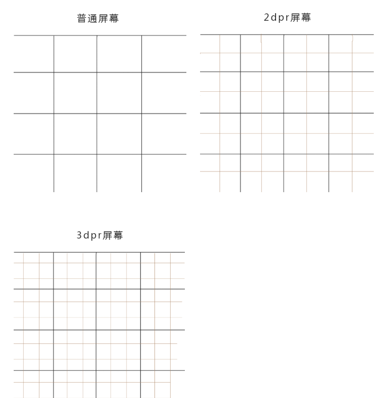
我们可以发现,在同样的大小下,2dpr的屏幕时普通屏幕像素点的4倍,3dpr的屏幕时普通屏幕像素点的9倍。这就是retina屏幕用了都说好的原因(清晰)。
1px细线问题
在上文我们已经知道,CSS像素为1px宽的直线,对应的物理像素是不同的,可能是2px或者3px,而设计师想要的1px宽的直线,其实就是1物理像素宽。而设计师要的实际1px的边框就是下面这种情况:
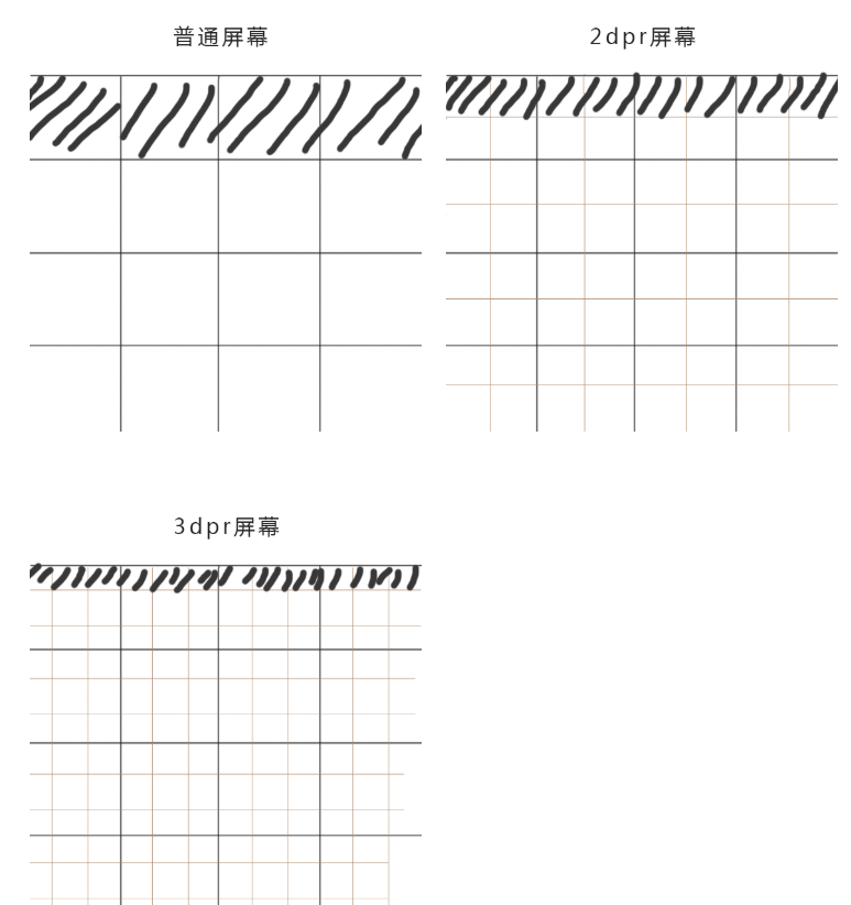
对于CSS而言,可以认为是border: 0.5px;,这是多倍屏下能显示的最小单位。然而,并不是所有手机浏览器都能识别border: 0.5px,有的系统里,0.5px会被当成为0px处理,那么如何1px细线问题呢?
解决方法
1.使用border-image实现
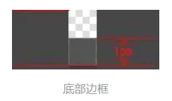
准备一张符合你要求的border-image:
样式设置:
.border-bottom-1px {
  border- 0 0 1px 0;
  -webkit-border-image: url(linenew.png) 0 0 2 0 stretch;
  border-image: url(linenew.png) 0 0 2 0 stretch;
}
上文是把border设置在边框的底部,所以使用的图片是2px高,上部的1px颜色为透明,下部的1px使用视觉规定的border的颜色。
优点:
- 可以设置单条、多条表框。
缺点:
- 更换颜色和样式麻烦,需要更改图片;
- 某些设备上会模糊。
2.使用background-image实现
background-image 跟border-image的方法一样,你要先准备一张符合你要求的图片。然后将边框模拟在背景上。
样式设置:
.background-image-1px {
  background: url(../img/line.png) repeat-x left bottom;
  -webkit-background-size: 100% 1px;
  background-size: 100% 1px;
}
优缺点与border-image一样;
3.多背景渐变实现
与background-image方案类似,只是将图片替换为css3渐变。设置1px的渐变背景,50%有颜色,50%透明。
样式设置:
.background-gradient-1px {
  background:
    linear-gradient(#000, #000 100%, transparent 100%) left / 1px 100% no-repeat,
    linear-gradient(#000, #000 100%, transparent 100%) right / 1px 100% no-repeat,
    linear-gradient(#000,#000 100%, transparent 100%) top / 100% 1px no-repeat,
    linear-gradient(#000,#000 100%, transparent 100%) bottom / 100% 1px no-repeat
}
/* 或者 */
.background-gradient-1px{
  background:
    -webkit-gradient(linear, left top, right bottom, color-stop(0, transparent), color-stop(0, #000), to(#000)) left / 1px 100% no-repeat,
    -webkit-gradient(linear, left top, right bottom, color-stop(0, transparent), color-stop(0, #000), to(#000)) right / 1px 100% no-repeat,
    -webkit-gradient(linear, left top, right bottom, color-stop(0, transparent), color-stop(0, #000), to(#000)) top / 100% 1px no-repeat,
    -webkit-gradient(linear, left top, right bottom, color-stop(0, transparent), color-stop(0, #000), to(#000)) bottom / 100% 1px no-repeat
}
优点:
- 可以实现单条、多条边框
- 边框的颜色随意设置
缺点:
- 代码量不少
- 圆角没法实现
- 多背景图片有兼容性问题
4.使用box-shadow模拟边框
利用css 对阴影处理的方式实现0.5px的效果
样式设置:
.box-shadow-1px {
  box-shadow: inset 0px -1px 1px -1px #c8c7cc;
}
优点:代码少,兼容性好。缺点:边框有阴影,颜色变浅。
上面四种方式效果并不是太好;
5.伪元素+transform
构建1个伪元素, border为1px, 再以transform缩放到50%。
对于老项目,有没有什么办法能兼容1px的尴尬问题了,个人认为伪类+transform是比较完美的方法了。
原理是把原先元素的 border 去掉,然后利用 :before 或者 :after 重做 border ,并将 transform 的 scale 缩小一半,原先的元素相对定位,新做的 border 绝对定位。
单条border样式设置:
.scale-1px{
  position: relative;
  border:none;
}
.scale-1px:after{
  content: '';
  position: absolute;
  bottom: 0;
  background: #000;
   100%;
  height: 1px;
  -webkit-transform: scaleY(0.5);
  transform: scaleY(0.5);
  -webkit-transform-origin: 0 0;
  transform-origin: 0 0;
}
四条boder样式设置:
.scale-1px{
  position: relative;
  margin-bottom: 20px;
  border:none;
}
.scale-1px:after{
  content: '';
  position: absolute;
  top: 0;
  left: 0;
  border: 1px solid #000;
  -webkit-box-sizing: border-box;
  box-sizing: border-box;
   200%;
  height: 200%;
  -webkit-transform: scale(0.5);
  transform: scale(0.5);
  -webkit-transform-origin: left top;
  transform-origin: left top;
}
最好在使用前也判断一下,结合 JS 代码,判断是否 Retina 屏:
if(window.devicePixelRatio && devicePixelRatio >= 2){
  document.querySelector('ul').className = 'scale-1px';
}
优点:可以满足所有场景,且修改灵活。缺点:对于已使用伪类的元素(例如clearfix)要多层嵌套。
6.viewport + rem 实现
同时通过设置对应viewport的rem基准值,这种方式就可以像以前一样轻松愉快的写1px了。
在devicePixelRatio = 2 时,输出viewport:
<meta name="viewport" content="initial-scale=0.5, maximum-scale=0.5, minimum-scale=0.5, user-scalable=no">
在devicePixelRatio = 3 时,输出viewport:
<meta name="viewport" content="initial-scale=0.3333333333333333, maximum-scale=0.3333333333333333, minimum-scale=0.3333333333333333, user-scalable=no">
这种兼容方案相对比较完美,适合新的项目,老的项目修改成本过大。
优点:
- 所有场景都能满足
- 一套代码,可以兼容基本所有布局
缺点:
- 老项目修改代价过大,只适用于新项目