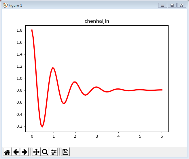
一,用matplotlib库在坐标系中绘制基本的三角函数
(1)程序一代码如下:
import numpy as np
import matplotlib.pyplot as plt
x=np.linspace(0,6,100)
y=np.cos(2*np.pi*x)*np.exp(-x)+0.8
plt.plot(x,y,'k',color='r',linewidth=3,linestyle="-")
plt.title("chenhaijin")
plt.show()
执行效果如下:
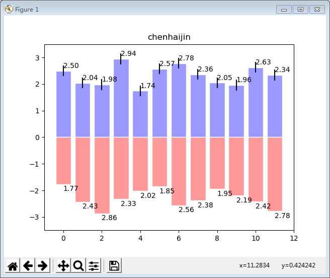
二,用matplotlib库画柱状图
经常在数据显示的时候我们会使用柱状图,通常柱状图又包括两种,一种是竖直的,一种是水平的柱状图,现在我们来进行一一讲解和演示。
由于水平柱状图和竖直柱状图相似,参数差不多,个别参数名称不同,所以这里详细描述竖直柱状图,水平柱状图仅给一个示例。
1 竖直柱状图的源码
import numpy as np
import matplotlib.pyplot as plt
n = 12
# 生成一个1-12的列表,不包括12,[ 0  1  2  3  4  5  6  7  8  9 10 11]
x = np.arange(n)
# np.random.uniform(0.5,1.0,n),生成n个0.5-1.0之间的随机数
y1 = 3 * np.random.uniform(0.5,1.0,n)
y2 = 3 * np.random.uniform(0.5,1.0,n)

# 生成一个包含有n个值,均为0.2的list,表示允许的误差范围[-0.2,0.2]
error = [0.2,] * n

# bar(left, height, width=0.8, bottom=None, hold=None, **kwargs)
# 绘制柱形图
# left:柱形图的x坐标
# height柱形图的高度,以0.0为基准
# 柱形图的宽度,默认0.8
# facecolor:颜色
# edgecolor:边框颜色n
# bottom:表示底部从y轴的哪个刻度开始画
# yerr:应该是对应的数据的误差范围,加上这个参数,柱状图头部会有一个蓝色的范围标识,标出允许的误差范围,在水平柱状图中这个参数为xerr
plt.bar(x,+y1,width=0.8,facecolor="#9999ff",edgecolor="white",yerr=error)
plt.bar(x,-y2,facecolor="#ff9999",edgecolor="white")
# 绘制文字,显示柱状图形的值
for x,y1,y2 in zip(x,y1,y2):
    plt.text(x+0.4,y1+0.05,'%.2f' % y1,ha='center',va='bottom')
    plt.text(x+0.4,-(y2+0.05),'%.2f' % y2,ha='center',va='top')

plt.ylim(-3.5,3.5)
plt.title("chenhaijin")
plt.show()
执行效果如下: