1.安装依赖:
npm install echarts -S
2.在.vue文件中引入:
var echarts = require("echarts");
3.开始使用,先创建一个简单的折线图,效果如下:

贴上代码:
<template>
  <div class="head">
    <div id="echartContainer"></div>
  </div>
</template>

<script>
var echarts = require("echarts");
export default {
  data() {
    return {};
  },
  mounted() {
    //基于准备好的dom, 初始化echarts实例
    let myChart = echarts.init(document.getElementById("echartContainer"));
    myChart.setOption({
      title: {
        show: true, //显示折线图
        text: "简单折线图", //标题文字
        subtext: "单位", //副标题
        left: 50, //配置title的位置
        padding: [5, 20, 5, 10] //title的padding值
      },

      xAxis: {
        data: ["衬衫", "羊毛衫", "雪纺衫", "裤子", "高跟鞋", "袜子"],
        name: "产品"
      },
      yAxis: {},
      series: [
        {
          name: "销量",
          type: "line",
          data: [10, 20, 36, 10, 10, 20],
          itemStyle: {
            normal: {
              color: "hotpink"
            }
          }
        }
      ]
    });
  }
};
</script>


<style scoped>
#echartContainer {
  margin: 0 auto;
  width: 500px;
  height: 500px;
}
</style>
在右侧添加工具栏:
toolbox: {
        show: true, //是否显示工具栏组件
        orient: "vertical", //工具栏icon的布局朝向
        itemSize: 18, //工具栏icon的大小
        itemGap: 20, //item之间的间距
        right: 20, //toolbox的定位位置
        feature: {
          saveAsImage: { show: true }, //导出图片
          dataView: { show: true }, //数据视图
          magicType: {
            //动态类型切换
            type: ["line", "bar"]
          },
          dataZoom: { show: true }, //数据区域缩放
          restore: { show: true } //重置
        }
      },
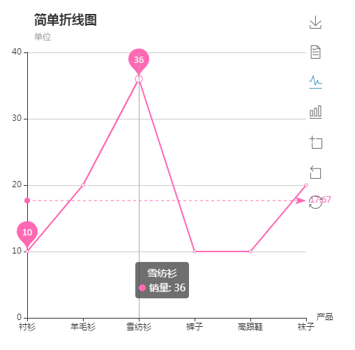
给图标添加平均值和最大最小值,最后的代码是这样的:
<template>
  <div class="head">
    <div id="echartContainer"></div>
  </div>
</template>

<script>
var echarts = require("echarts");
export default {
  data() {
    return {};
  },
  mounted() {
    //基于准备好的dom, 初始化echarts实例
    let myChart = echarts.init(document.getElementById("echartContainer"));
    myChart.setOption({
      title: {
        show: true, //显示折线图
        text: "简单折线图", //标题文字
        subtext: "单位", //副标题
        left: 50, //配置title的位置
        padding: [5, 20, 5, 10] //title的padding值
      },
      toolbox: {
        show: true, //是否显示工具栏组件
        orient: "vertical", //工具栏icon的布局朝向
        itemSize: 18, //工具栏icon的大小
        itemGap: 20, //item之间的间距
        right: 20, //toolbox的定位位置
        feature: {
          saveAsImage: { show: true }, //导出图片
          dataView: { show: true }, //数据视图
          magicType: {
            //动态类型切换
            type: ["line", "bar"]
          },
          dataZoom: { show: true }, //数据区域缩放
          restore: { show: true } //重置
        }
      },
      tooltip: {
        trigger: "axis" //通过哪种方式触发tip
      },
      xAxis: {
        data: ["衬衫", "羊毛衫", "雪纺衫", "裤子", "高跟鞋", "袜子"],
        name: "产品"
      },
      yAxis: {},
      series: [
        {
          name: "销量",
          type: "line",
          data: [10, 20, 36, 10, 10, 20],
          itemStyle: {
            normal: {
              color: "hotpink"
            }
          },
          markPoint: {
            data: [
              { type: "max", name: "最大值" },
              { type: "min", name: "最小值" }
            ]
          },
          markLine: {
            data: [
              { type: "average", name: "平均值" }
            ]
          }
        }
      ]
    });
  }
};
</script>
效果是这样的:
4.按需引入,全局引入所有的echarts图表打包,导致体积过大。
在vue文件中引入:
let echarts = require('echarts/lib/echarts')
// 引入柱状图组件
require('echarts/lib/chart/bar')
// 引入提示框和title组件
require('echarts/lib/component/tooltip')
require('echarts/lib/component/title')
export default {
  name: 'hello',
  data() {
    return {
      msg: 'Welcome to Your Vue.js App'
    }
  },
  mounted() {
    this.drawLine();
  },
  methods: {
    drawLine() {
      // 基于准备好的dom,初始化echarts实例
      let myChart = echarts.init(document.getElementById('myChart'))
      // 绘制图表
      myChart.setOption({
        title: { text: 'ECharts 入门示例' },
        tooltip: {},
        xAxis: {
          data: ["衬衫", "羊毛衫", "雪纺衫", "裤子", "高跟鞋", "袜子"]
        },
        yAxis: {},
        series: [{
          name: '销量',
          type: 'bar',
          data: [5, 20, 36, 10, 10, 20]
        }]
      });
    }
  }
}
记录一下学习的东西。更多效果请看官网:https://echarts.baidu.com/option.html